What Is Landing Page Design

Maximizing Conversions with Effective Landing Page Design Elements
Sick of pouring hours into landing pages that flop harder than a bad sitcom pilot? Yeah, we’ve all been there.
Turns out, if your landing page looks like it was thrown together during a power outage, people are gonna bounce faster than you can say “conversion rate.”
But hey, don’t start stress-eating your keyboard just yet. I’ve got your back. What is landing page design and why do you need it?
We’re about to rip the curtain off what actually makes a landing page work (hint: it’s not just pretty colors and a stock photo of a grinning person with a salad).
Stick around, because I’m about to spill all the juiciest tips and design hacks to turn those snooze-worthy pages into conversion machines.
We’ll dig into the good stuff—what works, what flops, and maybe even what’ll make your competitors cry a little.
So, grab your beverage of choice, and let’s jump headfirst into the wild world of landing page design. Ready? Let’s do this.
Click here to see my #1 recommendation for making money online
Introduction to What is Landing Page Design?
A well-designed landing page can be the difference between a user bouncing from your site and becoming a paying customer.
In this post, we’ll go over some key design elements that you can use to create an effective landing page that maximizes conversions.
The first thing to keep in mind when designing your landing page is the intent of the user. What are they looking for when they arrive on your page?
Make sure that your page answers their question or solves their problem. If you’re not sure what the user’s intent is, do some research or ask them directly.
Once you know what the user is looking for, you can start designing your page around that. Here are some key elements to include in your design:
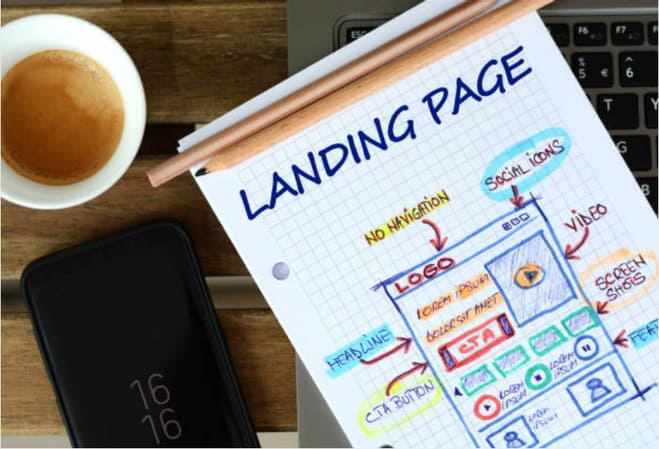
Headline: The headline should be clear and concise, and it should address the user’s needs.
Copy: The copy should be well-written and persuasive, without being too salesy. It should also be relevant to the user’s needs.
Images: Use images sparingly, and make sure they add value to the content. Avoid using stock photos whenever possible.
Call-to-action (CTA): Your effective Call To Action should be prominent and highly visible. Make sure it’s clear what the user needs to do, and use strong language that encourages them to take action.
Forms: Forms should be short and easy to fill out. Avoid asking for too much information up front, as this will likely dissuade users from completing the form.
These are just a few of the key elements you should include in your landing page design. With a well-designed landing page, you can maximize conversions and increase sales.
Benefits of Landing Page Design
Before we go further into What is Landing Page Design, let’s first have a look at the benefits of having a landing page.
There are several key benefits to landing page design that can help you maximize conversions on your website.
By focusing on creating a clear and concise design, you can ensure that visitors know exactly what they need to do when they land on your page.
Additionally, by using effective calls to action and including relevant images and videos, you can further increase the likelihood that visitors will take the desired action.
When done correctly, landing page design can be an extremely effective tool for driving conversions. By taking the time to create a well-designed page, you can see a significant increase in the number of visitors who take the desired action.
If you’re looking to maximize conversions on your website, consider implementing some of these key landing page design elements.
Click here to see my #1 recommendation for making money online
Key Elements of a Successful Landing Page
There are many factors that contribute to a successful landing page, but some key elements include:
1. A clear and concise headline that tells visitors what they can expect on the page.
2. Compelling copy that describes the offer clearly and persuades visitors to take action.
3. A strong call-to-action (CTA) that encourages visitors to click through to the next step in the conversion process.
4. A well-designed layout that is easy to navigate and makes use of whitespace, visuals, and other design elements to focus attention on the most important information.
5. Fast loading time and mobile responsiveness to ensure that visitors have a positive experience regardless of how they are accessing the page.
Best Practices for Creating a Conversion Optimized Landing Page
In this part of what is landing page design we are going to have a look what conversion rate optimization is and how to improve it.
Conversion rate optimization is a process of testing and tweaking your website with the goal of increasing the percentage of visitors who take a desired action.
There are many different factors that can affect conversion rates, but some of the most important ones are the design and layout of your landing page.
Here are some best practices for creating a landing page that is optimized for conversions:
1. Keep it simple – The simpler your landing page, the easier it is for visitors to understand what you want them to do. Too much text or too many images can be overwhelming and cause people to leave without taking action.
2. Use a strong headline – Your headline should clearly state what you are offering and why someone should take advantage of it.
3. Include a call-to-action – A call-to-action (CTA) is a button or link that tells visitors what you want them to do next. Make sure your CTA is prominently displayed and easy to find.
4. Use images – People are more likely to engage with content that includes images, so make sure to include relevant pictures on your landing page.
5. Use testimonials – If you have satisfied customers, showcase their testimonials on your landing page. This can help build trust and encourage others to convert as well.
6. Keep forms short – If you require visitors to fill out a form, make sure it is short and easy to complete.
7. Use trust seals – If you have any security or privacy seals, make sure to display them prominently on your page. This will help build trust and encourage visitors to convert.
8. Test different versions – When creating a landing page, it’s important to test different versions of the page in order to see which one converts best.
Try changing the design, layout, content, colors, and imagery until you find a version that works best for your audience.
Click here to see my #1 recommendation for making money online
Tips for Improving Conversion Rates
Your landing page is the first thing potential customers see when they click on your ad, so it’s important to make a good impression. Here are a few tips for improving your conversion rates with landing pages:
1. Keep it simple. Don’t try to cram too much information onto your landing page. Stick to the essentials and make sure it’s easy for visitors to find what they’re looking for.
2. Make it visually appealing. Use images and/or short videos to break up the text and add visual interest.
3. Use persuasive copy. Write attention grabbing headlines and descriptions that convince visitors to convert.
4. Include a strong call to action. Tell visitors exactly what you want them to do, such as “Sign up now” or “Buy now.”
5. Test, test, test! Always try different versions of your landing page to see what works best. Split-testing is an essential part of any effective marketing campaign.
By following these tips, you can ensure your landing page is optimized for maximum conversion rates. Good luck!
Examples of High Converting Landing Pages
In this part of What is Landing Page Design, we will have a look at a few key design elements that all high converting landing pages have in common.
By including these elements in your own landing page design, you can help ensure that your visitors take the desired action on your site.
Some of the most important elements to include on your landing page are:
- A clear and concise headline that tells visitors what they can expect on your page
- Subheadings and bullet points to break up the text and make it easy to scan
- Images or videos that help illustrate your point
- Calls-to-action (CTAs) that are prominently displayed and easy to spot
- Social proof in the form of testimonials or customer reviews
- A strong offer that is tailored to your target audience
Including these elements on your landing page will help increase its conversion rate by making it more user-friendly and effective at communicating its message.
Click here to see my #1 recommendation for making money online
Conclusion
This article should have answered the question what is landing page design? Effective landing page design elements can be the difference between a successful and unsuccessful website.
By understanding how to use these elements correctly, you can maximize conversions and create an optimal user experience that will help drive your business’s success.
When designing or updating your landing pages, remember to consider all of the different design components to make sure they work together in order to provide visitors with the best possible experience.
With some thoughtful planning and experimentation, you’ll be able to increase conversions and see results quickly!
Thanks for reading this article about What is Landing Page Design. Hope you got useful info out of it to improve your marketing efforts.
Click the image below to watch a video how to build a landing page live. You will discover that you don’t need software, plugins, or tools to build amazing landing pages.

