How To Write A Call To Action In Seven Easy Steps

7 Elements of an Effective Call-to-Action Button
Frustrated with CTA buttons that just aren’t performing? Or maybe you’re unsure where to even start with effective CTA design—totally understandable.
Let’s get straight to it. You need to know how to write a call to action. There are seven critical factors behind a high-performing Call To Action button.
From selecting the right colors (hint: contrast actually matters) to writing copy that genuinely compels action, these aren’t just fluff—they’re the basics you need if you want data-driven results.
Ready to optimize your click-through rates and drive real conversions? Check out these 7 expert-backed strategies. Time to turn those buttons into actual conversion engines.
Click here for my #1 recommendation for making money online while working from home
Introduction on How to Write a Call to Action
In this intro we’ll explain how to write a call to action, what it is and why you need it.
A call-to-action button is a key element in any effective marketing campaign and therefor must be part of your marketing strategy.
It is the final step in the journey that you want your customers to take, and as such, it needs to be clear, concise, and visually appealing.
There are a few things to keep in mind when designing your call-to-action button:
1. The color of the button should contrast with the background so that it stands out.
2. The text on the button should be short and to the point, try to use no more than 4-5 words. Use actionable language that encourages the reader to click through.
3. The size of the button should be large enough to be easily noticed and clicked on.
4. The placement of the button should be above the fold on your landing page or website so that visitors don’t have to scroll down to find it.
It is also a good idea to put a second Call To Action lower on the page, as some visitors like to get more information first before clicking the button.
Following these guidelines will help ensure that your call-to-action button is effective and drives conversions for your business.
What Makes an Effective Call to Action?
An effective call-to-action button is one that is clear, concise, and visible. The text should be easy to read and understand, and the button should be placed in a prominent location on the page.
The color of the button should contrast with the surrounding elements on the page, making it stand out and easy to find.
Element 1: Be Direct
The most effective call-to-action buttons are direct. They tell the user exactly what they need to do, what to expect, and they make it easy for the user to understand it.
The button should be placed in a prominent position on the page, and it should be the only thing that the user needs to click on to complete the action.
The button should be clearly labeled with text that describes the action that will be taken by the website visitor.
For example, if the goal of the button is to get the user to sign up for a newsletter, the text on the button should say “Sign Up” or “Sign Up For The Free Newsletter”.
The text should be short and to the point, so that there is no confusion about what the button does. It only takes 4-5 words to let the visitor know what to expect when they press the button.
The color of the button is also important. It should be a color that stands out from the rest of the page. It should be a color that is associated with taking action (such as green or blue).
The size of the button should also be large enough to be easily clicked on by users.
Element 2: Use Actionable Language
When it comes to creating an effective call-to-action button, the language you use is just as important as the design.
Your CTA should be clear and concise, with a strong verb that encourages the reader to take action. For example, instead of saying “download our white paper,” try “download our free white paper.”
In addition to using actionable language, your CTA should also be specific. Be sure to include what the reader will get by clicking on your button, whether it’s a free download, access to a webinar, or something else.
By being clear about what the reader can expect, you’ll be more likely to get them to take the desired action.

Element 3: Provide Clarity
Your call-to-action button should be clear and concise. The text should be easy to read and understand, and the button itself should be highly visible.
You want your visitors to know exactly what they need to do in order to take advantage of your offer, so make sure your call-to-action button is impossible to miss.
Click here for my #1 recommendation for making money online while working from home
Element 4: Create Urgency and Scarcity
An effective call-to-action button should create a sense of urgency for the user. The button should be designed in a way that encourages the user to take action immediately.
The button should be placed in a prominent position on the page, and it should be large enough to be easily noticed by the user.
The text on the button should be clear and concise, and it should include a strong call-to-action verb such as “Buy Now,” “Sign Up,” “Subscribe” or “Download.”
A good example of creating urgency and scarcity is to make it look like there is only limited availability, such as “Only 5 left at this price” or “Almost sold out”.
As most people don’t want to miss out on a good opportunity, they are more likely to click the button and eventually make a purchase.
The color of the button should contrast with the surrounding elements on the page, and it should be easy to read.
The button should also have enough white-space around it so that it stands out from the rest of the page.
Element 5: Personalize the Message
Your call-to-action button should be personalized to fit the specific offer or message that you’re trying to communicate.
This means that the text on your button should be relevant and persuasive, without being too sales-y.
Some good examples of personalized call-to-action button text include:
Get Your Free eBook Now
Download Our Free Whitepaper
Sign Up For Our Free Trial
Access Your Complimentary Report Now
Each of these examples is tailored to a specific offer, which makes them more effective than generic button text like “click here” or “submit.”
Element 6: Utilize Colors and Contrast
The colors and contrast of your call-to-action button are important elements to consider when designing an effective CTA.
The button should be a color that stands out against the background of your page. The text should be a contrasting color that is easily readable.
The button should also have enough space around it so that it is not lost in the page design.
Element 7: Test Different Variations
When it comes to call-to-action buttons, one size does not fit all. In order to determine what works best for your website or app, it’s important to test different variations of your button.
This could include testing different colors, text, sizes, or even the placement of the button on the page.
By testing different variations of your call-to-action button, you can figure out what works best for your specific audience and goals.
This is an important step in ensuring that your call-to-action button is effective and drives the desired results.
Click here for my #1 recommendation for making money online while working from home
Final Thoughts
Now you know how to write a call to action. While the design of your call-to-action button is important, what’s most important is that the button is effective.
To make sure your CTA button is highly effective, keep the following elements in mind:
– The button should be designed to stand out from the rest of your page so that visitors can easily see it and know what it’s for.
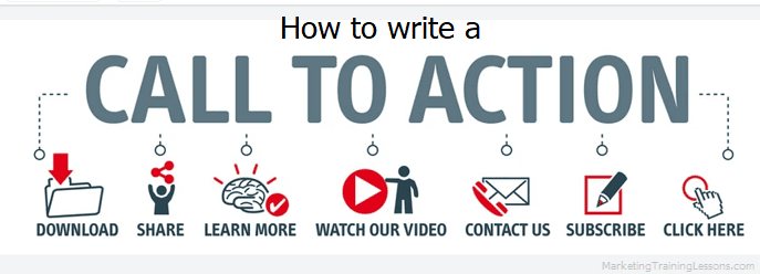
– The text on the button should be clear and concise, telling visitors exactly what they need to do. For example, “Buy Now”, “Sign Up”, “Join Today” or “Learn More.”
– Use power words to get the attention of your readers. Using power words can get you lots more clicks.
– The button should be placed in an easily visible spot on your page. Try to place it near the top so that visitors don’t have to scroll down to find it.
– Highlight the benefit of clicking the button, so visitors know what’s in it for them, and they will be more likely to click the button.
– Make sure you test different versions (A-B testing) of your CTA button to see which one performs best. Try different colors, sizes, and positions on the page to see what works best for your visitors.
By following these tips on how to write a call to action, you can ensure that your CTA button is effective and helps to convert more visitors into customers.
Thanks for reading this article about how to write a call to action. Click the image below to get training on how to create a call to action.

