Best Website Color Schemes With The 60-30-10 Rule
Discover the Best Website Color Schemes
Good website color schemes shape the mood, usability, and appeal of a site more than people may realize. When visitors land on a page, color is one of the first things they notice.
As someone who has built and reviewed dozens of websites, I’ve seen how picking the right colors can help content pop and guide user attention.
Choosing a balanced palette is one of those details that quietly supports the entire browsing experience and even helps improve search rankings by keeping users engaged for longer.
As you can improve search engine rankings with a balanced color palette, you can expect more visitors and also increase sales.
Why Color Schemes Matter for Websites
Color on a website isn’t just for decoration. It helps with branding, accessibility, and even how easily people can find their way around a page.
Colors have a psychological effect, influencing visitor feelings and actions. For example, many ecommerce sites use blue for trust and reliability, while tech companies often choose green to signal growth and innovation.
Carefully choosing your color palette helps both designers and business owners make better decisions that give a boost to their brands.
Poor color combinations can make text hard to read or cause users to quickly leave a site. Simple changes, like adjusting text and background contrast, can make a big difference in how professional and accessible a website feels.
Even SEO is impacted, since a clear and attractive color scheme keeps users around, tells search engines that the page is useful, and encourages sharing.
Furthermore, users tend to remember the visual impression a site leaves, meaning color directly shapes brand recognition.
Core Principles: Understanding Color Combinations
When I help someone pick a color scheme, the focus is on harmony, contrast, and balance. Knowing some color basics makes the job much easier.
Here are some terms that are really worth knowing:
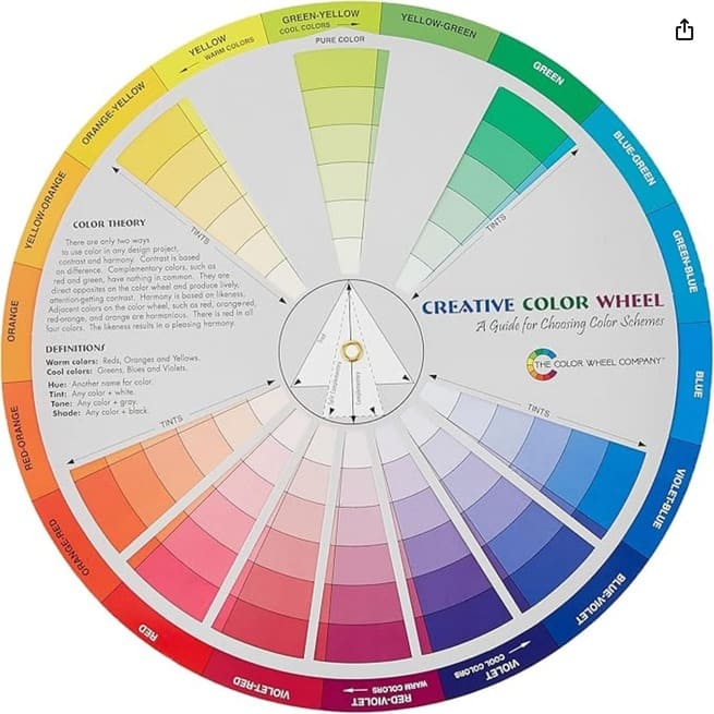
- Monochromatic: Uses one color in different shades and tints. These schemes are simple and visually calming, great for minimalist or content-focused designs.
- Analogous: Picks colors that sit next to each other on the color wheel. This kind of setup creates a seamless flow across the design, which is good for narrative sites or portfolios.
- Complementary: Uses colors opposite each other on the wheel, such as blue and orange, to create a bold and lively mood.
- Triadic: Picks three colors equally spaced on the color wheel, like red, yellow, and blue. This combination offers strong contrast with a naturally balanced look.

Click here for a full size image of the color wheel.
Keeping things consistent is important, so I would advice to stick with a set palette across pages and devices.
Using too many colors can lead to a visual mess and confuse users as to what your brand actually represents. Limiting your choices helps with building a site that feels unified and easy to use.
Applying the 60-30-10 Rule to Website Design
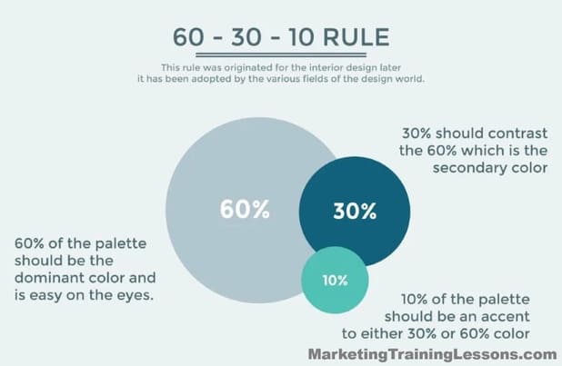
The 60-30-10 rule is a straightforward way to organize colors for any kind of visual project, and I use it constantly when building websites. Here’s the breakdown:
- 60% – Dominant color: This is the background or the major areas of your web page. Neutral shades or core brand colors are perfect for this spot.
- 30% – Secondary color: This shade backs up the main color and is usually found on navigation bars, side sections, or cards.
- 10% – Accent color: The accent color is what pulls the user’s attention. You’ll use it for call-to-action buttons, important icons, and highlights, helping to guide visitors throughout the site.

Following this ratio brings order to the color layout and keeps things looking clean. It prevents the site from feeling crowded and lets key features stand out just enough to catch the user’s eye.
The 60-30-10 method can also be adjusted depending on your goals: a photography portfolio might use a darker dominant color, for example, while an online store could go for a light, spacious look with pops of color for promotions.
Best Website Color Combinations
Picking the right color combinations helps give your website a polished, modern vibe. Here are some of the best website color schemes that work especially well in 2025 (and beyond):
- Navy and Soft Gold: Navy for the base, with gold accents for sophistication. This timeless palette is ideal for business or portfolio sites where a sense of trust and prestige is important.
- Muted Green, Cream, and Charcoal: Calming and fresh, this combo is perfect for anything wellness, finance, or ecofriendly.
- Peach, Slate Blue, and White: Peach as a highlight brings warmth, while blue and white maintain coolness. Great for creative shops and friendly service brands.
- Pale Pink, White, and Deep Teal: Soft pink warms things up while teal anchors the design, creating a stylish feel for fashion, blogs, or personal brands.
- Classic Black, White, and Red: High contrast with a spark of energy. Use black and white for structure, then let red draw attention to sense-of-urgency elements like sales or sign-up buttons.
The best plan is to try out a few combinations and let your target audience’s preferences help guide the final palette. If you want near-limitless options, give a color palette generator a try.
These tools show instant previews and make it simple to compare different aesthetics until you find something that clicks with your brand tone and message.
How to Use a Color Palette Generator
Online color palette generators make picking your scheme quick and effective. I rely on tools like Coolors and Adobe Color to get a project going and lock in a palette that matches the project’s needs.
Here’s my usual process:
- Pick a base color to match your brand’s character and purpose. For instance, blue is reliable, green is fresh, orange is energetic.
- Use the generator to create sets of coordinated shades. Many of these tools follow color theory principles so your combinations look professional by default.
- Test your palette on actual site mockups. Always make sure your headlines, menus, and buttons are clear against their backgrounds.
- Edit with feedback in mind. Adjust your palette until both you and early testers like the look and the site feels welcoming and easy to use.
Using a color generator can also help make sure your scheme meets accessibility needs, since contrast ratios are often shown automatically.
Accessibility is both a technical and ethical best practice, letting everyone enjoy your content regardless of vision differences.
The WCAG guidelines for web contrast offer an additional resource to check if your palette meets recommended levels.
Common Website Color Scheme Mistakes and How to Avoid Them
Over the years, I’ve seen some pitfalls happen over and over. The most common is low contrast, making it hard to read content.
This issue especially hurts mobile users, who might quickly bounce if key text is hard to make out. Bright, clashing colors are another trap, creating chaos where visitors should feel calm and focused.
- Lack of Contrast: If the text doesn’t pop against the background, users will struggle. Always double-check your combinations for readability.
- Ignoring Branding: Straying too far from a brand’s signature colors or tone breaks trust and can make your site look generic.
- Chasing Trends: While it’s tempting to use trending palettes, they can feel outdated fast, leaving your site behind after just a year or two.
- Too Many Colors at Once: Limit yourself to a few core shades plus neutral tones for the most professional appearance.
To dodge these traps, get a few friends, colleagues, or clients to check your site on different devices. Honest outside opinions can help spot weak points and highlight strengths you may miss on your own.
Advanced Tips for Making the Most of Your Color Scheme
Once you’ve got a palette you like, leveling up your design depends on a few smart moves. Here are advanced tips from experience:
Accessibility Comes First: Use tools like those from WebAIM or Google Lighthouse to check your site in real-world contexts. Inclusive design broadens your audience and boosts engagement.
Think About Emotional Responses: Match your color choices to your site’s voice and mission. For example, muted greens and blues create a peaceful vibe for mental health sites, while saturated colors energize digital agencies and start-ups.
Use Gradients Wisely: A subtle gradient effect across headers, buttons, or background sections can give your design depth without adding clutter. Gradients can blend single color and multicolored palettes seamlessly.
Checking out what top companies are doing can provide inspiration and help you track down palettes that really work.
Leaders like Spotify, Dropbox, and Stripe use well-designed blue and green combinations to make users feel safe and motivated.
Popular Website Color Scheme Examples
- LinkedIn: Blue and white communicate trust, with touches of blue for key actions.
- Airbnb: Soft coral and white, anchored by deep navy text, makes for a friendly, modern look that’s easy to use every day.
- Evernote: Green, white, and grey. Evernote’s signature green highlights their focus on productivity and sustainability, giving a unique identity and an ecofriendly feel.
When you line up your own site next to these examples, you can spot opportunities for improvement and get a sense of which combinations really help important content shine.
Frequently Asked Questions
What’s the best way to select a color scheme for my website?
Start by figuring out the mood or message you want your site to send. Choose a main color based on your brand, then put a color palette generator to work for some inspiration. Stick with the 60-30-10 rule to keep a simple, organized style.
How do I check if my color palette is accessible?
Use online tools like WebAIM’s contrast checker. Always test your choices with real people—including people with vision differences. Accessibility expands your site’s reach, which is a win-win for everyone.
Are there any online tools to help me build a palette?
Absolutely. Tools like Coolors, Adobe Color, and Paletton are easy to use. They offer a bunch of combinations automatically—just one click and you can experiment till you find a look you love.
Final Thoughts
Getting your website’s color scheme just right shapes visitor perceptions and how engaged they are on your site. Even little tweaks—like a crisper accent or a more contrasting header—make a site more eye-catching and user friendly.
To find the best website color schemes, I always encourage starting from your brand’s core, following the 60-30-10 approach, and keeping a consistent look throughout every page.
Most importantly, keep testing and stay open to feedback; a flexible approach helps your site stand out.
Your audience’s experience should guide your choices, so stay curious and keep things fresh as your brand grows.

