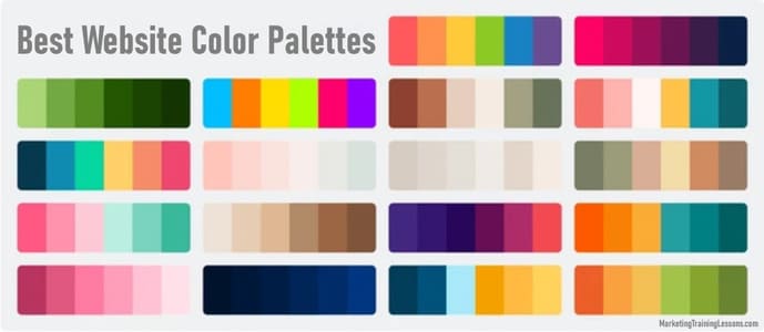
Best Website Color Palettes For Stunning Web Design

The Right Website Color Palette
Choosing the right website color palette makes a huge difference to both how a site looks and how users interact with it.
I often see people get caught up in the details, thinking all color choices are just a matter of taste. You have to know that the science and psychology behind the best website color palettes are pretty interesting.
The right palette doesn’t only leave a good first impression; it can drive clicks, support accessibility, and even help with branding for businesses and personal projects.
Click here for my #1 recommendation for making money online while working from home
Why Website Color Palettes Matter
When I’m working on a new website, color is one of the first things I think about. People generally recognize a site’s personality and trustworthiness within seconds.
This opinion often comes just from colors and layout. The right palette supports readability, helps users find what they need, and sets a certain mood without them even realizing it.
The best website color palettes can even influence their behavior and decision making, what can be used to generate more sales.
Vibrant, bold tones tend to create energy and excitement, while softer, muted colors can relax visitors or suggest reliability. Some studies have shown that users might decide whether they like or trust a site within the first 90 seconds.
A big chunk of that opinion comes from colors alone. If a website’s color scheme is confusing or harsh to the eye, people are more likely to leave quickly.
How to Choose a Website Color Palette
When I start picking colors for a site, I consider branding, accessibility, and the messages those colors send. If there’s already an existing logo, I build around those colors to keep a unified brand presence.
For totally new projects or personal sites, online tools like Coolors and Color Hunt help spark some ideas.
I focus on balance, not making things too bright or too dull, and always double-checking contrast for users who might have visual impairments.
Stumbling upon the right color scheme might take some trial and error. It helps to think about different elements of the site as you go, like backgrounds, text, buttons, and links.
Each of these can use colors in a way that gives the total design a boost. I suggest checking out sites in a similar niche to get a sense of what works and what feels stale, and then adding your own spin on it.
Click here for my #1 recommendation for making money online while working from home
Most Popular Website Color Palettes in 2025
Some of the best website color palettes pop up repeatedly because they’re easy to look at and versatile. Here are a few types I’ve seen work well for a lot of sites, from ecommerce to blogs to portfolios.
- Soft Neutrals: Beige, cream, light gray, and soft olive feel modern and calming. These palettes are easy to pair with almost anything and prioritize readability, which is super important for blogs and service-based sites.
- Bold Contrast: Black and white with a single bright accent color—like teal, orange, or electric blue—makes call-to-action buttons pop while keeping the layout clean.
- Earthy and Organic: Warm browns, lush greens, muted blues, and offwhites create a friendly environment, which is why they appear so often on portfolio and health-related websites.
- Minimal Monochrome: Using several tints and shades of the same color (think various blues or all shades of green) offers a unified feel. This approach is straightforward but can look very stylish when executed well.
- Playful Pastels: Soft pinks, baby blues, mint greens, and buttery yellows give a gentle, fresh look. These palettes often pair well with brands targeting younger audiences or anything aiming to feel friendly.
What Color Is Best for a Website?
The best website color palettes depends a lot on what the site is for, who will use it, and what the brand wants to get across.
For example, blue is linked with trust and professionalism, which is why tech, banking, and healthcare sites rely on it.
Green usually represents growth, calm, or ecofriendly businesses.
Orange and yellow create energy and positivity, but can feel too bright if overused.
Red is powerful for getting attention, but I use it sparingly because big blocks of red can stress or overwhelm some visitors.
For most business sites, I recommend starting with a calm primary color that fits the brand and then adding one or two accent colors.
For portfolios and creative work, unusual color combos can help a site stand out. Even then, restricting yourself to a small palette is valuable to keep things tidy and professional.
Click here for my #1 recommendation for making money online while working from home
Website Palette Examples and When to Use Them
This part uses the basic HTML color codes to improve your web design.
- Classic Blue and White: Blue #1a73e8, White #ffffff, Gray #f6f7fb, Accent Yellow #ffd600. Excellent for tech, finance, and consulting sites. Keeps things structured and professional.
- Warm Natural: Olive #78866b, Beige #f5f3e7, Warm Gray #d3cfc9, Terracotta #b26238. Fits holistic brands, personal blogs, and ecofocused businesses wanting a welcoming atmosphere.
- Modern Citrus: Deep Navy #22223b, Bright Orange #ffab00, White #fffbea, Soft Teal #84dcc6. This gives ecommerce and lifestyle brands a youthful, energetic tone without overwhelming visitors.
- Minimal Monochrome Green: Dark Green #264653, Medium Green #2a9d8f, Mint #e9ecef. Feels calm and confident, making it a solid pick for agencies and wellness brands.
- Fresh Pastels: Baby Blue #c3eaff, Soft Pink #ffd6e0, Lemon #fff7b2, Cool Gray #dbe9f4. Great for kids’ products, beauty, or anyone wanting a warm, accessible environment.

How to Put Together a Userfriendly Website Palette
Follow the next steps to find the best website color palettes:
- Start with a Base Color: Often pulled from the logo or brand guidelines. If I’m starting from zero, I pick a color that reflects the site’s tone (blue for trust, green for calmness, etc.).
- Add a Neutral: Whites, grays, and beiges help break things up and keep the site readable. They’re useful for backgrounds and sections where you don’t want too much attention.
- Choose an Accent Color: This is the shade that draws the eye to buttons and links. It should be bright, but not so bold that it damages readability.
- Test for Contrast: Tools like WebAIM’s Contrast Checker help make sure that important text stands out for all users, including anyone with color blindness or low vision.
When building a color palette for websites, I always keep accessibility in mind so that as many people as possible can use the site comfortably.
This isn’t just good practice—it’s important for SEO and user loyalty too. In some regions, there are even legal guidelines to follow regarding accessibility.
Besides contrast, pay attention to the color meaning in your audience’s culture. Shades that look eye-catching in one country might come across as odd or even negative in another.
Whenever possible, test your site with friends or users from different backgrounds and pay attention to their feedback to discover the best website color palettes.
Click here for my #1 recommendation for making money online while working from home
Tips and Common Problems with Color Palettes
- Overuse of Bright Colors: Too many loud tones compete for attention and tire users out. I stick with one eye-catching accent and keep the rest muted.
- Poor Color Contrast: Low contrast between text and backgrounds makes sites hard to read. It’s crucial for both usability and accessibility to check all text for enough difference in color value.
- Neglecting Brand Consistency: Using offbrand colors in different places confuses users. I always keep a reference file of approved colors and use them consistently throughout the site.
- Ignoring Cultural Color Meanings: Colors can send very different signals around the world. Red, for example, is lucky in some cultures but means danger or stopping in others. Doing some quick research is helpful for global sites.
Other pitfalls to watch for: not accounting for users with color blindness, using too many fonts or styles with your color palette, and skipping over mobile testing.
For users with color blindness, it is better to use more than just color alone to communicate big differences and make important points stand out.
Don’t forget that color combinations that look fine on your laptop may not transfer well to phone screens.
Which Color Attracts Money, Attention, or Trust?
I hear this question a lot from small business owners. Green is usually linked with money, growth, and prosperity, so it’s a top pick for finance and eco brands.
Red grabs a lot of instant attention and can suggest urgency, but should only be used in small amounts to avoid overwhelming people.
Blue is trusted almost everywhere; it’s a safe bet for conveying stability and professionalism.
For brands that want to feel friendly and creative, orange or yellow will help without making things too serious.
It also pays to pay attention to your competitors. If everyone is using blue and gray in your industry, a splash of unexpected color might make your site memorable.
At the same time, don’t go overboard just for the sake of standing out. The palette should support your brand’s personality and business goals.
Click here for my #1 recommendation for making money online while working from home
Most Userfriendly Website Colors
Userfriendly design is about making things easy to read, simple, and comfortable for people with a range of abilities. I stick with calm backgrounds (white, off-white, light gray) and pair them with dark text for clarity.
For buttons or links, colors like blue, teal, or green stand out and still look good to people with color blindness. Visitors tend to prefer sites that are clean, not too flashy, and easy on the eyes.
Subtle shifts in shade and contrast play a big role too. For example, try a darker color for headings and a slightly softer one for body text to make pages feel tidier and easier to scan.
Don’t hesitate to get a once-over from someone who isn’t a designer—they’ll quickly spot if something is hard to read.
Frequently Asked Questions
Which color palette is best for a website?
I find that the best website color palettes blending one main color, a neutral, and a single accent color work for most sites. Strong contrast between text and background is always important.
Blues, greens, and easy neutrals like gray or white tend to be safe choices. Sites with very unique audiences might push boundaries, but simple palettes rarely disappoint.
What color stands out the most for call-to-action buttons?
Bright shades like yellow or vibrant green draw eyes quickly. They work best against backgrounds with plenty of contrast. Red also works, but needs to be used sparingly so it doesn’t feel too harsh.
Are there colors I should avoid on websites?
I generally avoid harsh neon shades or any pairing with low contrast (like light gray text on a white background). Overly trendy palettes can also look outdated quickly, so I stick with timeless choices for most projects.
Can color palettes improve SEO?
Good palettes don’t directly affect rankings. However, accessible color choices keep users engaged for longer and lower bounce rates.
Google picks up on positive user experience signals, so there’s an indirect benefit to using well-planned colors.
Click here for my #1 recommendation for making money online while working from home
Final Thoughts
Finding the best website color palettes starts with your brand, your audience, and your site’s main goals.
When I approach a new project, I keep things simple, focus on accessibility, and test a few different combinations to find one that’s both attractive and welcoming.
The results are always worth the time. Visitors will feel more at home and are more likely to return again and again.

